Branding
Branding includes all the visual aesthetics across your registry, from the color of the buttons to the registry's background. You will be asked for 4 different components for your branding. Click each one to learn their details and where they will be displayed.
- Small logo for the web browser tab & navigation
- Large logo for the Discover page
- Background
- Button colors
Small Logo
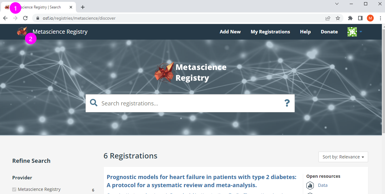
The small logo will be displayed in the web browser's tab (1) and an the navigation home page tab (2). Only a png file is accepted as a logo to allow background colors to show through.

Large Logo
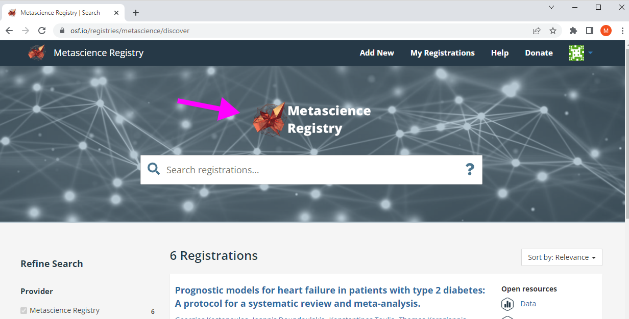
The large logo is displayed at the top of the Discovery page, above the search bar, and generally what users first see to determine if they are on the correct registry. Only a png file is accepted as a logo to allow background colors to show through.

Background
The background is used on both the Discover page (left image) and the page where researchers start a new registration (right image). The background can be either an image, pattern, or solid color. We recommend using content that's darker as white text is used on top of this visual. Either pngs or jpegs are accepted for images and patterns.

Button Colors
Researchers click a button to start a registration draft for your registry. Buttons uses two colors: one for how it typically looks (left) and one when someone hovers over it (right). An image, hex codes, or rbg codes are accepted.

